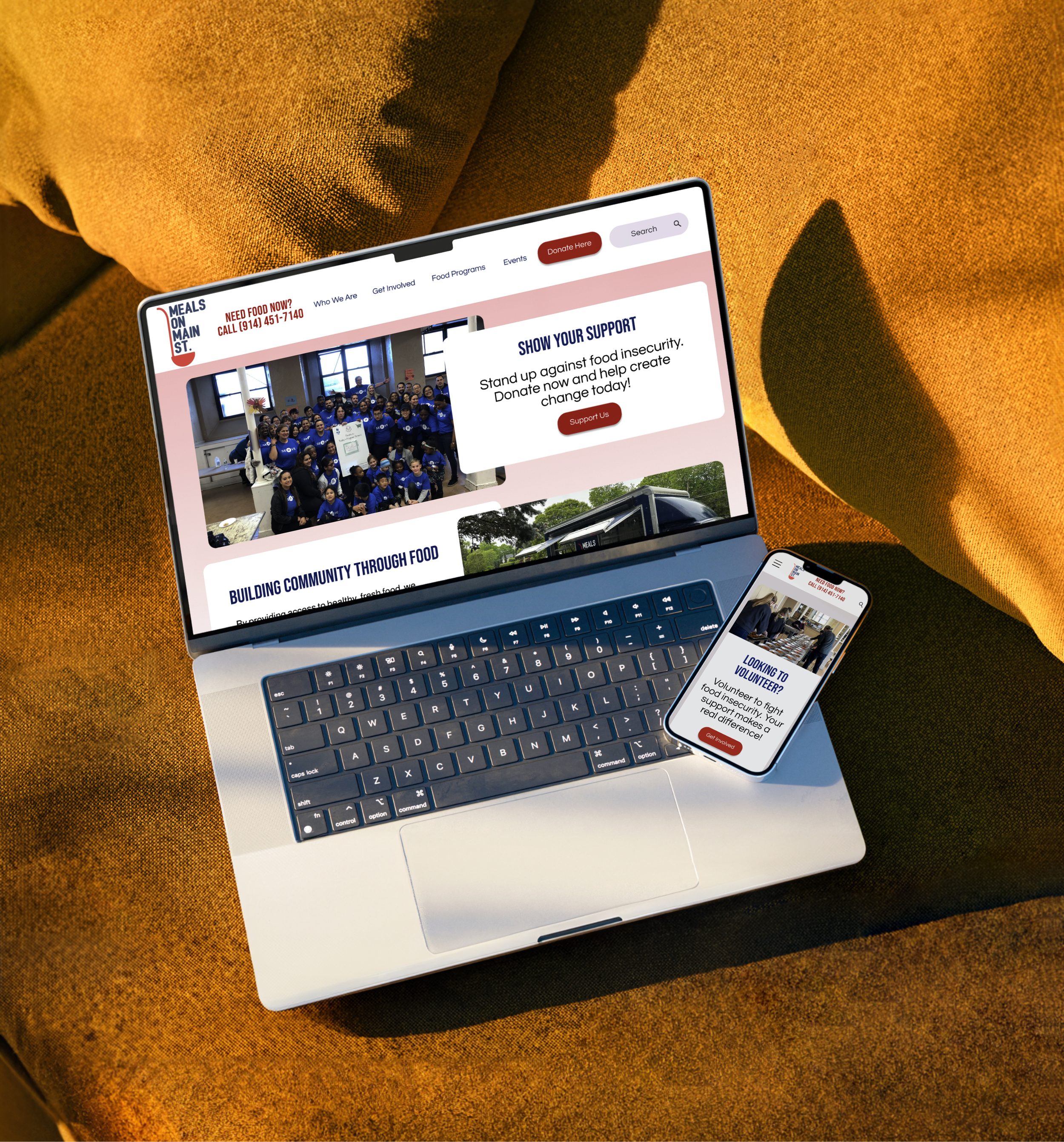
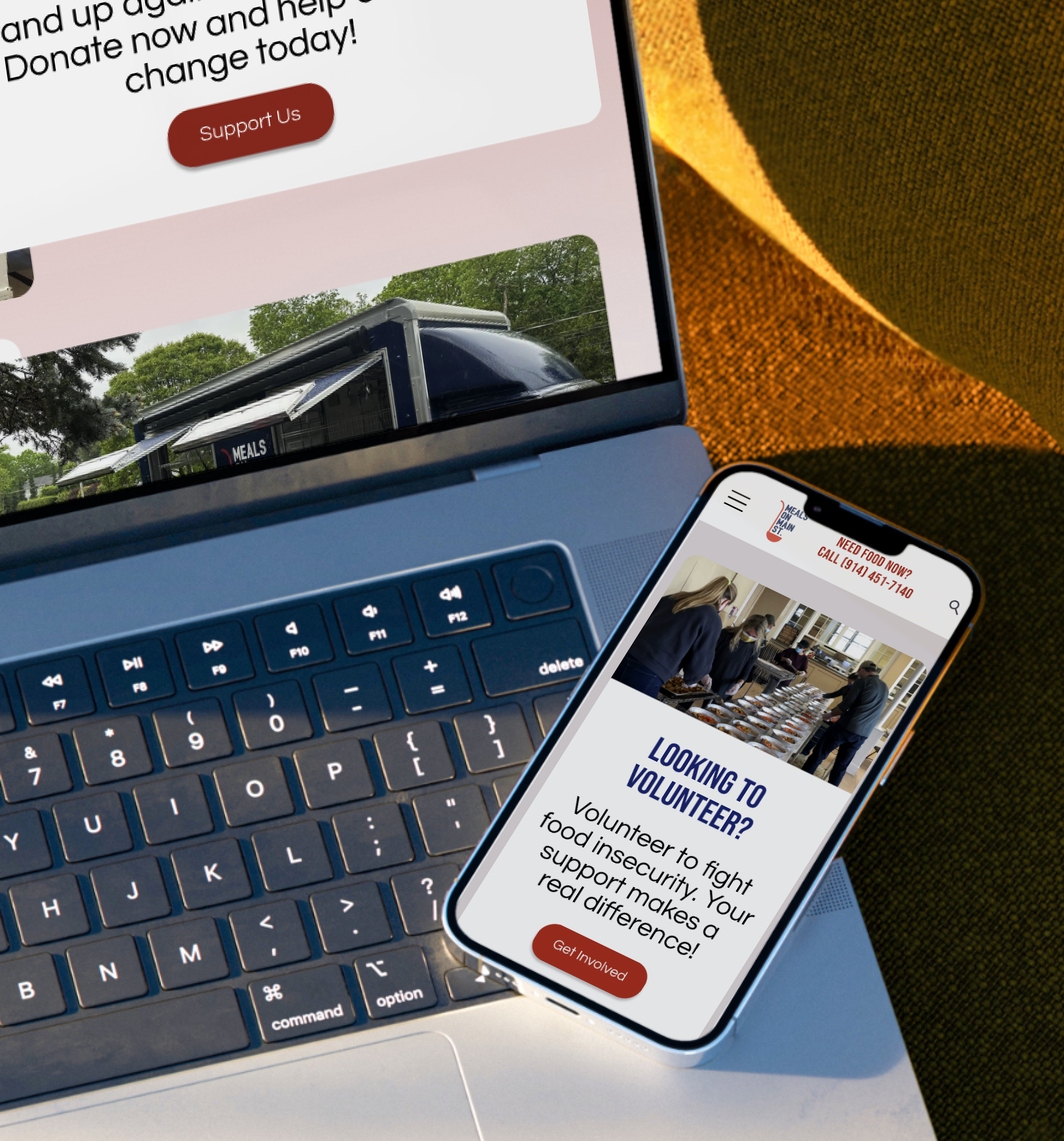
Meals on Main Street (MOMS) Website Redesign
Enhancing accessibility and user engagement for a non-profit organization
Helping communities fight food insecurity through better UX
Redesigning Meals on Main Street: A More Accessible Path to Giving Back
Meals On Main Street
Meals on Main Street is a non-profit dedicated to fighting food insecurity.
However, its outdated website made donating, volunteering, and accessing services difficult.
Our goal was to simplify the user journey, improve accessibility, and increase engagement through a UX/UI redesign.
Imagine you want to volunteer, but you can’t figure out where to sign up. You try different links, only to end up back where you started. Frustrating, right? That’s exactly what we observed in usability tests
We reorganized content, simplified navigation, and brought CTAs to the forefront. The result? A homepage that not only looks better—but works better for real people trying to make a difference.
📌 Explore how we prioritized features and content to better serve MOMS’ mission.
My Role & Team:
Role: UX/UI Designer
Team: 3 Designers
Timeline: 4 weeks
Tools: Figma, Google Analytics, Trello
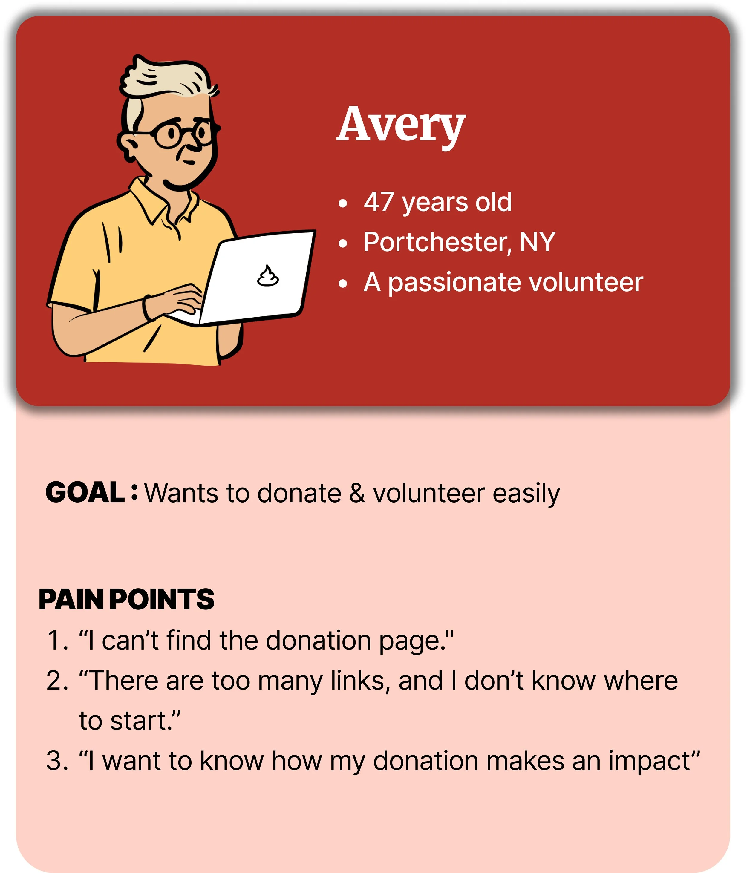
Proto Persona
Problem Statement:
Users struggled with confusing navigation, redundant links, and a lack of impact transparency, making it difficult to complete donations and volunteer sign-ups.
User Journey Map: Navigating the Volunteer Experience
To visualize the volunteer experience, we mapped persona’s journey navigating the existing website. This helped us identify key pain points as following, which guided our redesign strategy.
Unclear navigation
Cumbersome sign-up processes
💵 Feature Prioritization
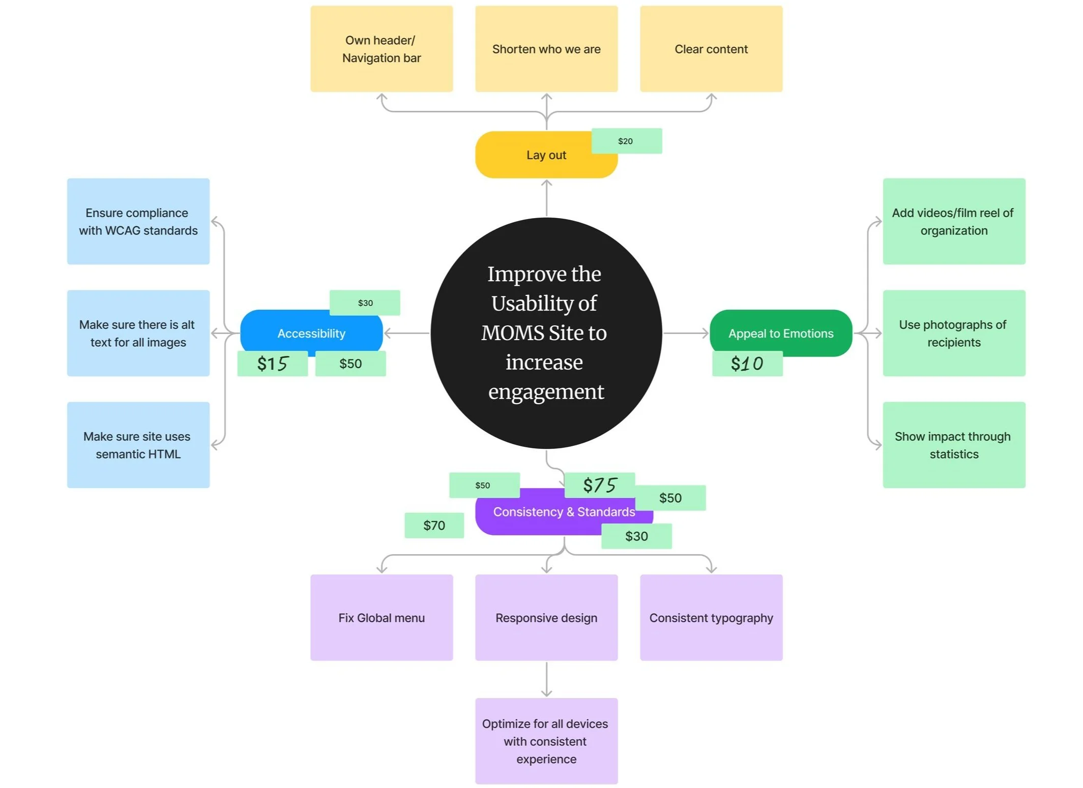
We ran a $100 Bill Test to align on high-impact features.
🔹 Top priorities: clearer donation flow, easier volunteer sign-up, mobile usability.
Based on these priorities, we concentrated on
enhancing navigation
implementing consistent typography
optimizing responsiveness
adding impactful visual elements
These design choices ensured the website aligned with user needs and MOMS’ mission.
Content Audit & Findings
We conducted a full audit of the existing site to identify gaps, redundancies, and user flow friction points related to donation and volunteer tasks
Many donation-related links were duplicated and unclear.
Volunteer pages were nested under unrelated sections.
Important info like program impact was hidden in downloadable files.
Simplifying Navigation: From Confusion to Clarity
🔁 Sitemap Redesign Highlights:
The original site had redundant paths and buried donation/volunteer actions
We grouped related content to improve flow and reduce confusion
CTAs like “Donate” and “Get Involved” are now more visible and direct
Streamlined structure reflects user goals and mental models
Old Site Map
New Site Map
Establishing UI Consistency
Before diving into UI design, we defined a visual language rooted in clarity, trust, and accessibility.
This style tile captures the essential elements—typography, brand colors, icons, and interaction states—that guided every screen we created.
Visual Style Highlights
Consistent brand identity with logo, colors, and icons
Readable fonts for accessibility
High-contrast buttons for clear calls to action
Clear visual hierarchy guides user flow
Real imagery builds trust and connection
→ With our visual foundation in place, we moved into wireframing and prototyping to bring the experience to life. We translated insights into wireframes to address core pain points—especially around donation and volunteer flows.
Simplified flows for donation & volunteering
Improved content hierarchy
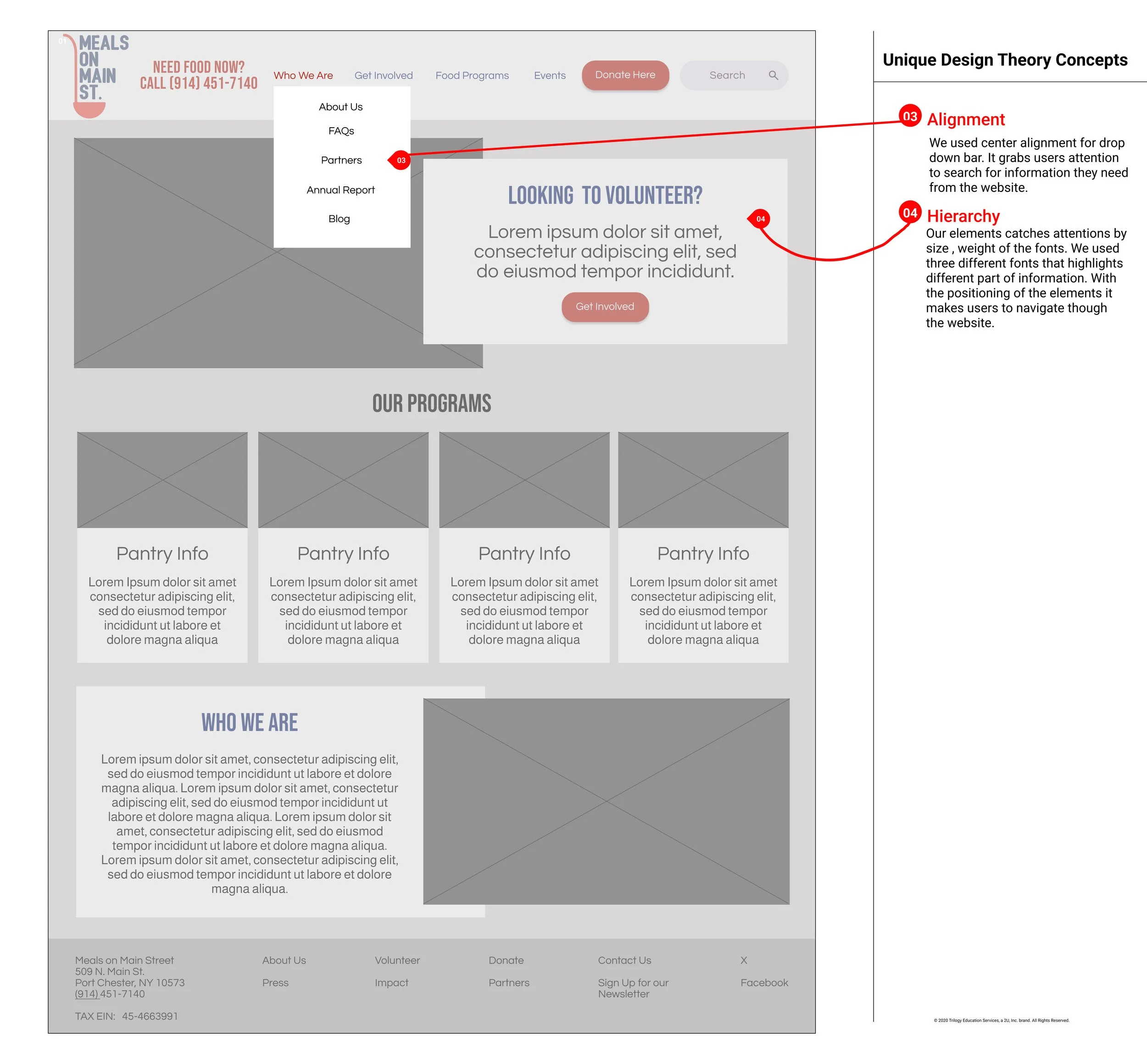
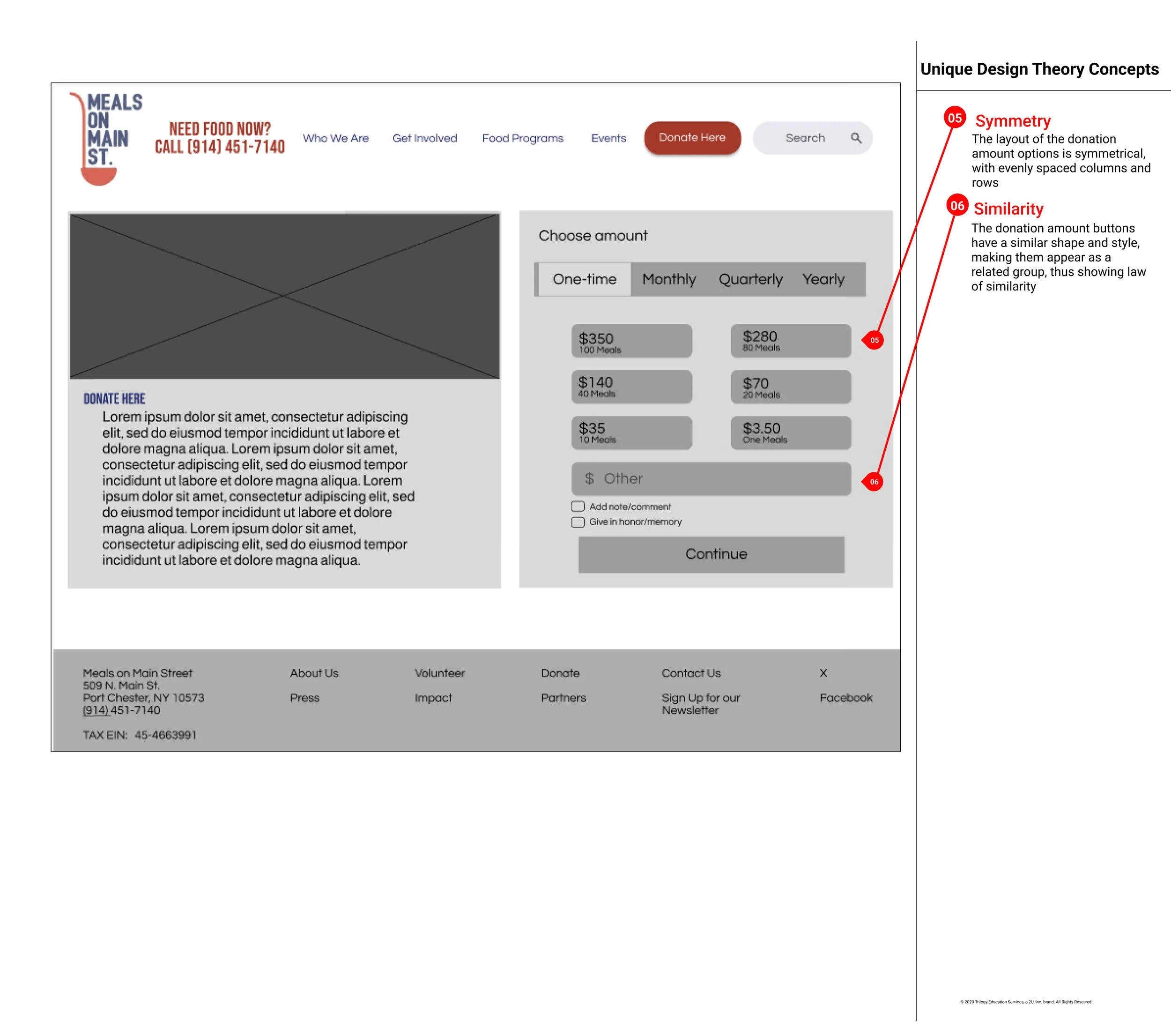
Wireframes: Structuring for Clarity & Engagement
This mid-fidelity prototype focused on improving visual hierarchy and grouping related information. Design decisions were grounded in design theory concepts to help users find key actions faster.
Interactive Final Design – Web & Mobile
Explore the final clickable prototypes, designed for both web and mobile. The experience is optimized for clarity, action-driven navigation, and accessibility.
Flows Include:
Desktop Prototype (Final)
Mobile A: Visual Hero Banner
Mobile B: Simplified CTA
Design Decision Backed by Data
We tested two homepage variations to see which layout encouraged more user interaction with donation and volunteer CTAs. Our findings helped shape the final design.
Key Takeaways
Prototype A was more engaging.
Users preferred the visual storytelling layout and found it easier to navigate.
Several testers noted that A “felt more trustworthy and easier to act on.”
Final Design Choice
We moved forward with Prototype A, using insights from this test to guide layout, CTA placement, and content clarity across web and mobile.
By restructuring the sitemap, clarifying CTAs, and optimizing the mobile experience, we helped streamline the journey for users to take action faster and with more confidence.
Impact & Results
📈 40% increase in user engagement with visual-based Prototype A
🕒 +46 sec average time spent on homepage post-redesign
📱 100% mobile-friendly layout with improved accessibility features
🔎 3x faster path to donation and volunteer pages (via simplified nav)
💬 4.6/5 avg. satisfaction score from usability testers
🧭 60% reduction in confusion navigating site content (based on feedback)
Design Reflections
Let’s Redefine Nonprofit Design, Together
This project reminded me that thoughtful design can drive real impact. I’m excited to keep building digital experiences that serve people, not just pixels.
👉 Have a project or collaboration in mind?


